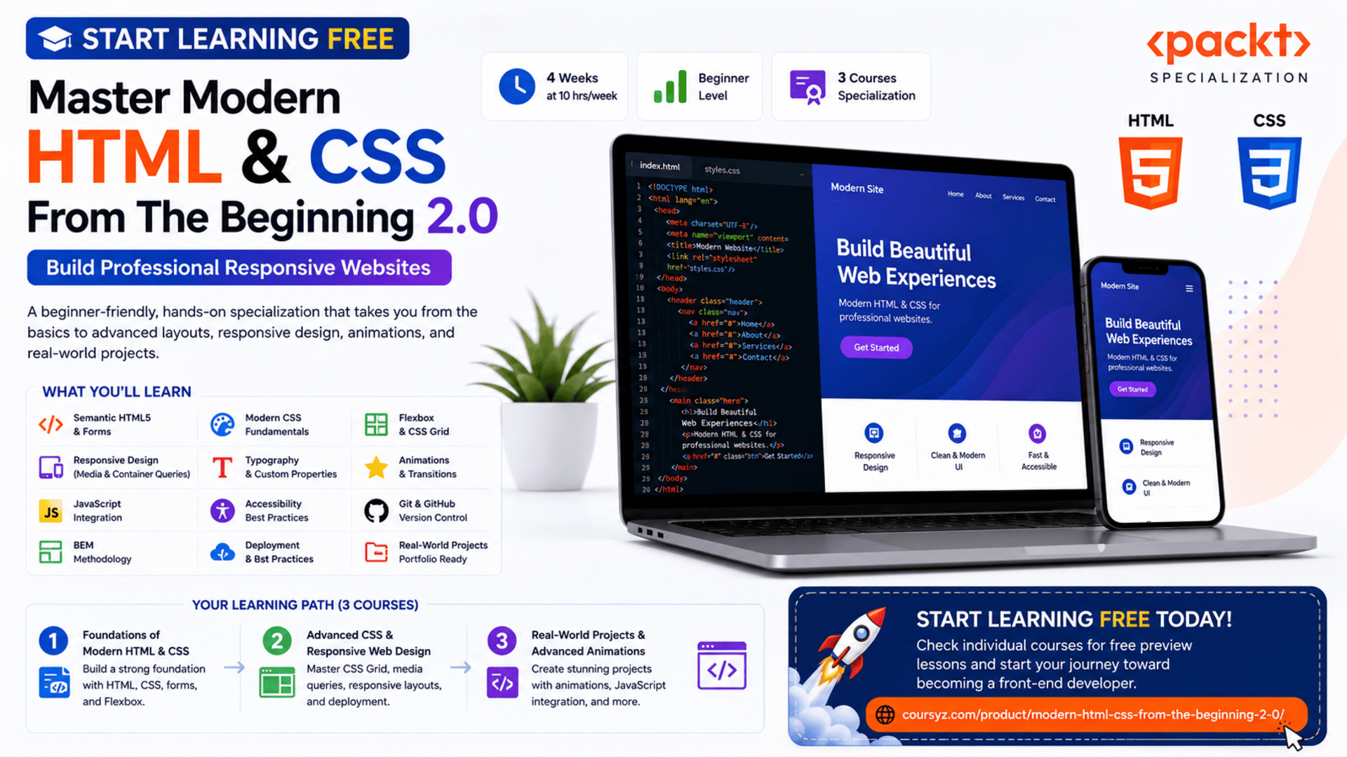
Start Learning Free: Master Modern HTML & CSS From the Beginning 2.0 and Build Professional Responsive Websites
Every professional website begins with two essential technologies: HTML and CSS.
HTML creates the structure of a webpage, while CSS controls its appearance, layout, responsiveness, typography, animations, and visual presentation.
Together, these technologies power landing pages, business websites, online portfolios, product pages, blogs, dashboards, forms, and modern web applications.
The Modern HTML & CSS From the Beginning 2.0 Specialization provides a structured learning path for beginners who want to build attractive, accessible, responsive, and professionally organized websites.
You may be able to start learning free by opening one of the individual courses and checking whether selected Preview lessons are available.
The program takes you from basic HTML documents and CSS styling to advanced layouts, responsive design, animations, transitions, JavaScript-powered interactions, version control, deployment, and portfolio-ready projects.
Why Learn Modern HTML and CSS?
HTML and CSS remain the foundation of front-end web development.
Even developers who later learn JavaScript frameworks, mobile development, back-end programming, or full-stack development still need a strong understanding of webpage structure and styling.
HTML and CSS skills can help you:
- Build professional websites
- Create responsive layouts
- Develop landing pages
- Design online portfolios
- Build business websites
- Style web applications
- Create accessible forms
- Improve mobile usability
- Customize website templates
- Work more effectively with designers
- Prepare for JavaScript and front-end frameworks
- Begin a freelance web-development career
Learning these technologies from the beginning gives you the confidence to create websites without depending entirely on premade themes or page builders.
About Modern HTML & CSS From the Beginning 2.0
Modern HTML & CSS From the Beginning 2.0 is a beginner-friendly specialization consisting of three courses.
The program is designed to be completed in approximately four weeks when studying around 10 hours per week.
It follows a flexible, self-paced structure, allowing you to learn according to your own schedule.
No previous professional web-development experience is required.
The three courses are:
- Foundations of Modern HTML & CSS
- Advanced CSS & Responsive Web Design
- Real-World Projects & Advanced Animations
The learning path begins with the fundamentals and gradually introduces more advanced design, layout, responsiveness, accessibility, animation, organization, and deployment techniques.
What You Will Learn
Throughout the program, you will learn how to:
- Create properly structured HTML documents
- Use essential HTML tags and attributes
- Build semantic webpages
- Add headings, paragraphs, images, and links
- Create lists and navigation areas
- Build interactive forms
- Style text, links, backgrounds, and elements with CSS
- Understand the CSS box model
- Use margins, borders, padding, and dimensions
- Build layouts with Flexbox
- Create advanced layouts with CSS Grid
- Design mobile-friendly websites
- Apply media queries
- Use container queries
- Work with rem, em, and viewport units
- Create responsive typography
- Use CSS custom properties
- Add transitions and animations
- Combine JavaScript with CSS
- Organize styles using BEM
- Apply accessibility principles
- Improve browser compatibility
- Use Git and GitHub
- Deploy web projects
- Build portfolio-ready websites
Course 1: Foundations of Modern HTML & CSS
Estimated duration: 11 hours
The first course introduces the essential building blocks of webpage development.
You will learn how HTML documents are structured and how CSS transforms basic content into a visually organized website.
Topics include:
- HTML document structure
- HTML elements and attributes
- Headings and paragraphs
- Images and links
- Lists
- Forms
- Input elements
- Text styling
- Colors
- Fonts
- Backgrounds
- Links and buttons
- The CSS box model
- Flexbox
- Responsive web design
- Accessibility principles
Understand HTML Document Structure
Every HTML webpage follows a structured format.
A basic document includes information such as:
- Document type
- HTML language
- Metadata
- Page title
- Stylesheets
- Visible webpage content
Example:
<!DOCTYPE html>
<html lang="en">
<head>
    <meta charset="UTF-8">
    <meta name="viewport" content="width=device-width, initial-scale=1.0">
    <title>My Professional Website</title>
    <link rel="stylesheet" href="style.css">
</head>
<body>
    <h1>Welcome to My Website</h1>
    <p>This is my first modern webpage.</p>
</body>
</html>
Understanding this structure is essential because every webpage depends on it.
Use Semantic HTML
Semantic HTML uses elements that clearly describe the purpose of the content.
Examples include:
headernavmainsectionarticleasidefooter
Semantic structure can improve:
- Accessibility
- Search-engine understanding
- Code readability
- Website maintenance
- Collaboration between developers
A clearly structured webpage is easier for both users and assistive technologies to navigate.
Create Links, Images, and Lists
Links connect pages and resources.
Images add visual information.
Lists organize related content.
You can use these elements to create:
- Navigation menus
- Product features
- Service lists
- Resource pages
- Portfolio galleries
- Contact sections
Each image should include useful alternative text when it communicates meaningful information.
Example:
<img
    src="responsive-design.jpg"
    alt="Responsive website displayed on desktop, tablet, and mobile screens"
>
Build Professional Forms
Forms allow users to interact with a website.
They are commonly used for:
- Contact requests
- Newsletter registration
- Account creation
- Login
- Search
- Checkout
- Booking
- Surveys
A professional form should include:
- Clear labels
- Appropriate input types
- Helpful instructions
- Required-field indicators
- Accessible error messages
- Logical keyboard navigation
- Mobile-friendly controls
Example:
<form>
    <label for="email">Email Address</label>
    <input
        type="email"
        id="email"
        name="email"
        required
    >

    <button type="submit">Subscribe</button>
</form>
Understand CSS Fundamentals
CSS determines how HTML elements appear.
A CSS rule includes a selector and one or more declarations.
Example:
body {
    font-family: Arial, sans-serif;
    line-height: 1.6;
    color: #1f2937;
    background-color: #ffffff;
}
You can use CSS to control:
- Typography
- Colors
- Backgrounds
- Borders
- Spacing
- Alignment
- Layout
- Responsiveness
- Animation
Learn the CSS Box Model
Every HTML element can be viewed as a rectangular box.
The CSS box model includes:
- Content
- Padding
- Border
- Margin
Understanding the box model helps you control element size and spacing.
Example:
.card {
    width: 320px;
    padding: 24px;
    border: 1px solid #d0d5dd;
    margin: 20px;
}
Many layout problems become easier to solve once you understand how these layers work together.
Start Building Layouts with Flexbox
Flexbox is a layout system designed for arranging elements along one main direction.
It is useful for:
- Navigation bars
- Feature sections
- Pricing cards
- Button groups
- Centered content
- Responsive rows
- Vertical alignment
Example:
.features {
    display: flex;
    gap: 24px;
    justify-content: center;
    align-items: stretch;
    flex-wrap: wrap;
}
Flexbox helps developers create layouts that adjust more naturally to different screen sizes.
Course 2: Advanced CSS & Responsive Web Design
Estimated duration: 12 hours
The second course moves beyond foundational styling and focuses on professional responsive layouts.
Topics include:
- Advanced Flexbox
- CSS Grid
- Media queries
- Container queries
- Responsive typography
- rem and em units
- Viewport units
- Browser compatibility
- Git
- GitHub
- Deployment
- Responsive forms
- Adaptive design
- Accessibility
Build Advanced Layouts with Flexbox
Advanced Flexbox techniques allow you to control:
- Element direction
- Alignment
- Wrapping
- Item growth
- Item shrinking
- Responsive spacing
- Element order
These features are especially useful when designing layouts that must adapt across many devices.
Create Two-Dimensional Layouts with CSS Grid
CSS Grid is designed for layouts that involve both rows and columns.
It can be used for:
- Page layouts
- Photo galleries
- Product grids
- Dashboards
- Feature sections
- Magazine-style pages
- Pricing tables
Example:
.projects-grid {
    display: grid;
    grid-template-columns: repeat(3, 1fr);
    gap: 24px;
}
A responsive version may use:
.projects-grid {
    display: grid;
    grid-template-columns: repeat(auto-fit, minmax(260px, 1fr));
    gap: 24px;
}
This automatically adjusts the number of columns according to available space.
Use Media Queries
Media queries apply styles when specific screen conditions are met.
Example:
@media (max-width: 768px) {
    .hero {
        flex-direction: column;
        text-align: center;
    }
}
Media queries can help you change:
- Layout direction
- Font sizes
- Navigation design
- Spacing
- Column count
- Visibility
- Image dimensions
They are an essential part of responsive web design.
Understand Container Queries
Media queries respond to the viewport size.
Container queries respond to the size of a specific parent container.
This allows reusable components to adapt according to where they are placed.
For example, the same product card can use one layout inside a wide content area and another layout inside a narrow sidebar.
Container queries support more flexible component-based design.
Create Responsive Typography
Typography should remain readable across screen sizes.
The program introduces units such as:
rememvwvh
You can also use clamp() to create fluid text sizes.
Example:
h1 {
    font-size: clamp(2rem, 5vw, 4.5rem);
}
This allows the heading to grow smoothly without becoming too small or too large.
Apply Mobile-First Design
Mobile-first design begins with styles for smaller screens and then adds enhancements for larger displays.
Example:
.course-card {
    display: block;
}

@media (min-width: 768px) {
    .course-card {
        display: flex;
    }
}
This approach encourages developers to focus on:
- Essential content
- Clear navigation
- Touch-friendly controls
- Fast loading
- Readable text
- Simple layouts
Improve Browser Compatibility
A website may behave differently across browsers.
You should test projects in multiple environments and review:
- Layout differences
- Unsupported properties
- Form appearance
- Font rendering
- Animation behavior
- Responsive breakpoints
Browser developer tools can help identify these issues.
Use Git and GitHub
Version control helps you manage and publish your work.
Git allows you to track changes, while GitHub provides an online home for your repositories.
You can use these tools to:
- Save project history
- Restore earlier versions
- Work with branches
- Share code
- Collaborate
- Publish portfolio projects
- Demonstrate your work to employers or clients
Deploy Your Websites
Deployment makes your website accessible online.
Before deployment, confirm that:
- File paths are correct
- Images load properly
- Forms work
- Links are valid
- Mobile layouts are tested
- Accessibility has been reviewed
- Unnecessary files are removed
- Production assets are optimized
A live website is more valuable in a portfolio than screenshots alone.
Course 3: Real-World Projects & Advanced Animations
Estimated duration: 11 hours
The final course focuses on creating polished, interactive, and portfolio-ready projects.
Topics include:
- CSS transitions
- Keyframe animations
- JavaScript integration
- Interactive elements
- Multi-section websites
- Smooth navigation
- Responsive projects
- CSS organization
- BEM methodology
- Accessibility
- Code reusability
- Application deployment
Add CSS Transitions
Transitions create smooth visual changes between element states.
Example:
.button {
    background-color: #175cd3;
    transform: translateY(0);
    transition: background-color 0.25s ease, transform 0.25s ease;
}

.button:hover {
    background-color: #004eeb;
    transform: translateY(-3px);
}
Transitions can improve:
- Buttons
- Links
- Cards
- Menus
- Forms
- Navigation elements
They should support usability rather than distract users.
Create Keyframe Animations
Keyframe animations allow more complex movement and visual effects.
Example:
@keyframes fade-in-up {
    from {
        opacity: 0;
        transform: translateY(24px);
    }

    to {
        opacity: 1;
        transform: translateY(0);
    }
}

.hero-content {
    animation: fade-in-up 0.7s ease forwards;
}
Animations may be used for:
- Hero sections
- Loading indicators
- Notifications
- Interactive cards
- Navigation menus
- Content reveals
Always consider reduced-motion preferences for users who may experience discomfort from animation.
Combine JavaScript with CSS
JavaScript can add or remove CSS classes in response to user actions.
Example:
const menuButton = document.querySelector(".menu-button");
const navigation = document.querySelector(".navigation");

menuButton.addEventListener("click", () => {
    navigation.classList.toggle("navigation--open");
});
This approach can create:
- Mobile menus
- Modal windows
- Accordions
- Tabs
- Interactive forms
- Dark mode
- Animated sections
Organize CSS with BEM
BEM stands for:
- Block
- Element
- Modifier
It is a naming methodology that helps organize CSS.
Example:
.card {}
.card__title {}
.card__description {}
.card--featured {}
BEM can improve:
- Code clarity
- Reusability
- Scalability
- Team collaboration
- Style maintenance
This becomes increasingly valuable as a project grows.
Build Real-World Projects
The specialization includes practical projects that help reinforce your skills.
Examples include:
- Responsive pricing grid
- Landing form
- Lumina Creative website
- Tutor website
- Multi-section responsive layouts
- Animated interface elements
These projects allow you to practise:
- HTML structure
- CSS styling
- Flexbox
- Grid
- Media queries
- Forms
- Accessibility
- Animations
- Responsive navigation
- Deployment
By the end of the program, you can have several websites ready to include in a portfolio.
Projects You Can Build After Completing the Program
Use your new skills to create original projects such as:
- Personal portfolio
- Digital agency website
- Restaurant landing page
- SaaS pricing page
- Online course website
- Travel website
- Product showcase
- Photography portfolio
- Business services website
- Event-registration page
A strong project should demonstrate:
- Semantic HTML
- Professional CSS
- Responsive design
- Accessibility
- Flexible layouts
- Clear typography
- Organized code
- Appropriate animations
- Browser compatibility
- Deployment
Who Should Take This Specialization?
This program may be suitable for:
Complete Beginners
No previous professional coding experience is required.
Aspiring Front-End Developers
The program builds the HTML and CSS foundation needed for more advanced front-end development.
Freelancers
Freelancers can learn how to create landing pages, portfolios, and business websites for clients.
Designers
UI and graphic designers can strengthen their ability to turn designs into functioning webpages.
Entrepreneurs
Entrepreneurs can learn how to create and customize websites for their businesses.
Marketing Professionals
Marketers can improve their ability to edit landing pages, forms, campaign pages, and website content.
Students
Students can build portfolio projects while developing practical web-development skills.
WordPress Users
WordPress users can improve their ability to customize themes, page layouts, forms, and responsive styles.
How to Start Learning Free
The full specialization is not officially available entirely free.
However, an individual course may sometimes display selected Preview lessons.
Follow these steps to check:
- Open the program page using the call-to-action button in this article.
- Scroll down to the three individual courses.
- Select the course you want to explore.
- Open the selected course page.
- Click Enroll.
- Sign in or create an account.
- Look for Preview instead of beginning a paid trial.
- Open any available videos and start learning free.
Important Access Notice
The Preview option may not be displayed.
When Preview is unavailable, review the enrollment page for:
- Financial aid
- Scholarships
- Employer-sponsored access
- Educational-institution access
- A limited subscription trial
The complete courses, graded work, projects, and certificate may require paid enrollment.
Always review the current payment terms before confirming.
How to Get the Best Results
Code Along with Every Lesson
Do not only watch the videos. Write the HTML and CSS yourself.
Rebuild Projects Without Copying
After completing a guided project, rebuild it using your own structure and design.
Practise Responsive Design
Test every project on desktop, tablet, and mobile layouts.
Use Semantic HTML
Choose elements according to their purpose rather than using generic containers for everything.
Keep CSS Organized
Group related styles, use consistent naming, and avoid unnecessary duplication.
Test Accessibility
Review labels, keyboard navigation, heading structure, contrast, and alternative text.
Use GitHub
Publish each project with a clear README file.
Deploy Your Best Work
A live website gives employers and clients a better way to evaluate your skills.
Create an Original Portfolio
Include at least three polished projects showing different layouts and design styles.
Potential Career and Freelance Opportunities
After building sufficient skills and a professional portfolio, learners may explore opportunities such as:
- Junior front-end developer
- HTML and CSS developer
- Website developer
- UI developer
- Landing-page developer
- Email-template developer
- WordPress customization specialist
- Web-design assistant
- Front-end development intern
- Freelance website creator
Completing the specialization does not guarantee employment.
Employers and clients may also evaluate:
- Portfolio quality
- HTML structure
- CSS organization
- Responsive-design ability
- Accessibility awareness
- GitHub activity
- Problem-solving
- Communication
- Ability to follow a design
- Attention to detail
Frequently Asked Questions
Can I start learning free?
You can check the individual courses for selected Preview lessons. Free access is not guaranteed.
Is the program suitable for beginners?
Yes. It is classified as beginner level and does not require previous professional experience.
How many courses are included?
The specialization contains three courses.
How long does it take?
The estimated completion time is approximately four weeks at around 10 hours per week.
Does it teach HTML?
Yes. It covers HTML structure, tags, attributes, forms, semantic elements, and accessibility.
Does it teach CSS?
Yes. CSS is the central focus of the program.
Are Flexbox and CSS Grid included?
Yes. The specialization covers both layout systems.
Does it include responsive design?
Yes. It covers media queries, container queries, mobile-friendly layouts, and responsive typography.
Are animations included?
Yes. The third course covers transitions, keyframes, and interactive animation techniques.
Does it include JavaScript?
It includes JavaScript integration for dynamic interface elements, but it is primarily an HTML and CSS program.
Are Git and GitHub covered?
Yes. Version control, GitHub, and deployment are included.
Will I build projects?
Yes. Projects include a pricing grid, landing form, Lumina Creative, Tutor, and responsive animated websites.
Does Preview access include the certificate?
No. Preview access generally does not include the complete graded experience or certificate.
Start Learning Free and Build Professional Responsive Websites
Master semantic HTML, modern CSS, forms, Flexbox, CSS Grid, media queries, container queries, responsive typography, accessibility, animations, GitHub, and real-world web projects.
Open an individual course and check whether Preview is available. Free preview access is not guaranteed. Complete courses, graded work, projects, and the certificate may require paid enrollment. Financial aid may be available.

