Modern websites need more than attractive colors and fonts.
They must remain clear, accessible, responsive, consistent, and easy to use across desktop computers, tablets, and mobile devices.
CSS is the technology that transforms basic HTML content into a polished digital experience.
It controls layouts, spacing, colors, typography, animations, responsive behavior, reusable design systems, and the visual hierarchy of a website.
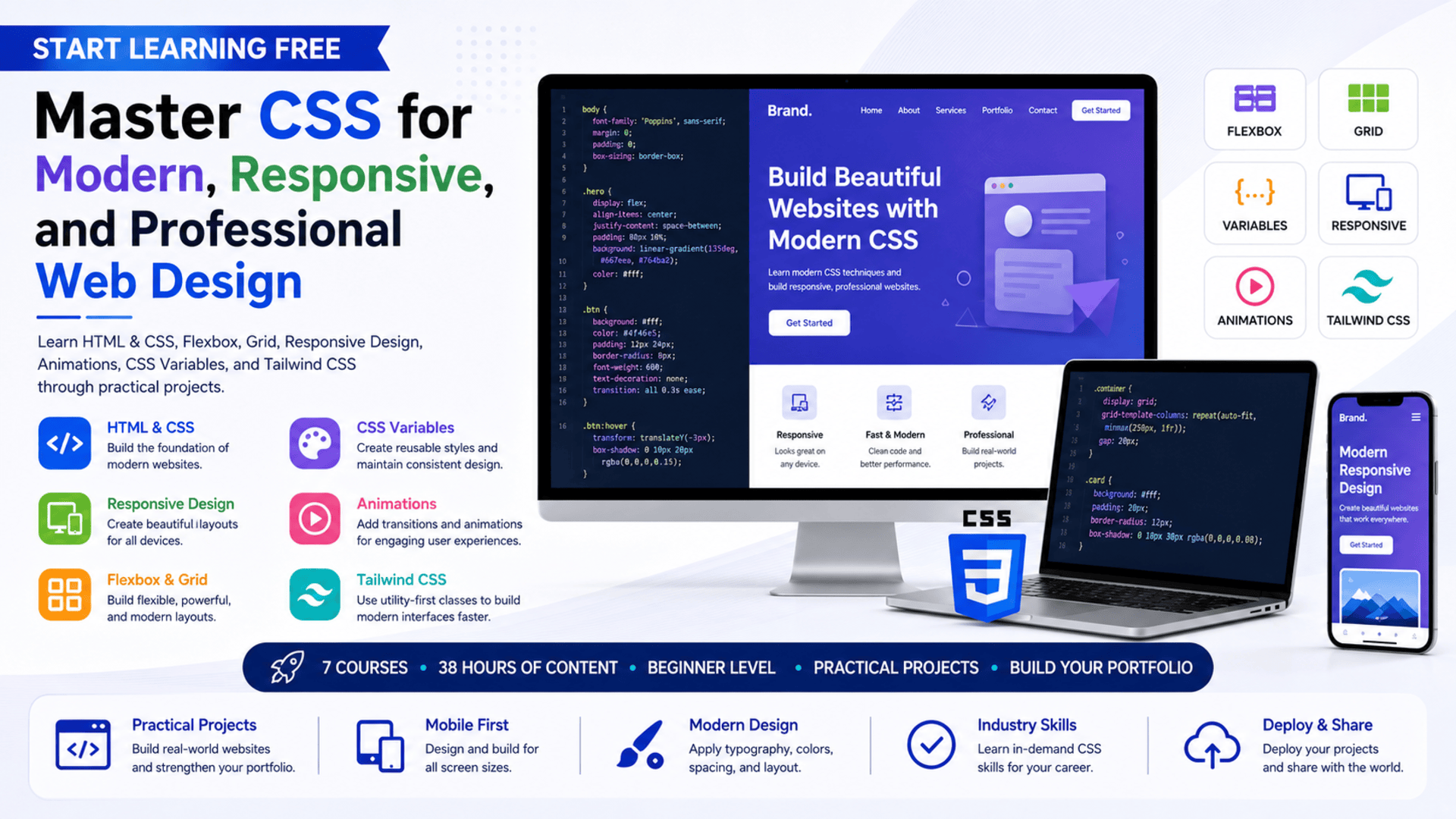
The CSS specialization provides a structured learning path for beginners who want to develop practical front-end and web-design skills.
Across seven connected courses, learners progress from HTML and CSS fundamentals to Flexbox, Grid, custom properties, responsive layouts, animations, and Tailwind CSS.
The program also includes practical projects that help learners apply CSS concepts to realistic website interfaces.
You may be able to Start Learning Free by opening an individual course and checking whether selected Preview materials are currently available.
What Is CSS?
CSS stands for Cascading Style Sheets.
It is the language used to control the appearance and layout of HTML documents.
HTML defines the structure and meaning of a web page, while CSS determines how that structure is presented visually.
CSS can be used to control:
- Colors
- Fonts
- Text sizes
- Line spacing
- Borders
- Backgrounds
- Margins
- Padding
- Alignment
- Page layouts
- Responsive behavior
- Transitions
- Animations
- Component styles
- Mobile presentation
Without CSS, most websites would appear as basic documents with limited visual organization.
With CSS, developers can transform the same content into a professional website, landing page, portfolio, dashboard, application interface, or online store.
Why CSS Is Essential for Modern Web Development
CSS is one of the core technologies of front-end development.
Even when developers use frameworks, component libraries, or website-building platforms, CSS remains central to controlling how interfaces look and behave.
Strong CSS skills can help developers:
- Reproduce interface designs accurately
- Create responsive layouts
- Improve website usability
- Maintain visual consistency
- Reduce duplicated styling
- Build reusable components
- Optimize interfaces for mobile devices
- Improve accessibility
- Add engaging motion
- Adapt layouts to different screen sizes
- Customize frameworks and templates
- Solve browser compatibility problems
CSS is also important for designers who want to understand how visual ideas are converted into working web pages.
About the CSS Learning Program
The CSS specialization is a beginner-level, seven-course learning path designed for aspiring web developers and digital creators.
The recommended schedule is approximately four weeks at ten hours per week.
The program offers a flexible learning structure, allowing learners to progress according to their own availability.
The complete course sequence includes approximately 38 hours of listed learning content:
- Learn HTML and CSS — 13 hours
- Learn CSS Flexbox — 1 hour
- Learn CSS Grid — 1 hour
- Learn CSS Variables — 1 hour
- Learn Responsive Web Design — 17 hours
- Learn CSS Animations — 3 hours
- Learn Tailwind CSS — 2 hours
The program begins with foundational website construction and gradually introduces more specialized layout, responsiveness, maintainability, animation, and framework skills.
What Will You Learn?
The program covers the essential knowledge needed to create modern, responsive, and professional website interfaces.
Major learning outcomes include:
- Building websites with HTML and CSS
- Structuring web content correctly
- Styling text, images, buttons, and sections
- Working with color palettes and typography
- Creating responsive page layouts
- Using CSS Flexbox
- Building layouts with CSS Grid
- Choosing between Flexbox and Grid
- Creating reusable CSS variables
- Reducing stylesheet duplication
- Applying media queries
- Designing for multiple screen sizes
- Creating transitions and animations
- Improving browser compatibility
- Styling websites with Tailwind CSS
- Building modular typography systems
- Using professional development tools
- Deploying website projects
- Applying current web-design practices
- Creating user-centered web interfaces
Course 1: Learn HTML and CSS
Estimated learning time: 13 hours
The first course introduces the foundations of website creation.
Learners study how HTML structures web-page content and how CSS transforms that content into a visually organized interface.
HTML concepts may include:
- Headings
- Paragraphs
- Links
- Images
- Lists
- Buttons
- Forms
- Page sections
- Semantic elements
CSS concepts include:
- Selectors
- Properties
- Values
- Classes
- Colors
- Fonts
- Spacing
- Borders
- Backgrounds
- Width and height
- Alignment
- Basic layouts
Creating Websites from Scratch
Learners develop experience writing HTML and CSS instead of relying entirely on prebuilt templates.
This helps them understand how website elements work together.
Visual Design Techniques
The course explores how to create attractive layouts using:
- Color palettes
- Font combinations
- Images
- Spacing
- Contrast
- Alignment
- Visual hierarchy
These elements help guide the user’s attention and make a website easier to understand.
Professional Development Tools
Learners are also introduced to tools used for:
- Code editing
- Collaboration
- Version control
- Project organization
- Website deployment
The practical work provides a strong foundation for the remaining CSS courses.
Course 2: Learn CSS Flexbox
Estimated learning time: 1 hour
Flexbox is a CSS layout system designed for organizing elements along a row or column.
It is especially useful when developers need to align, distribute, center, or reorder interface elements.
Flexbox can be used to build:
- Navigation bars
- Card layouts
- Button groups
- Form sections
- Image galleries
- Headers
- Footers
- Centered content
- Responsive content rows
Learners explore how to create responsive and dynamic layouts using Flexbox.
The course also includes practical work involving an image grid.
Why Learn Flexbox?
Before Flexbox, many common layouts required complicated workarounds.
Flexbox provides a more predictable method for controlling:
- Horizontal alignment
- Vertical alignment
- Space distribution
- Item order
- Flexible sizing
- Wrapping behavior
These capabilities make Flexbox one of the most useful tools in modern CSS.
Course 3: Learn CSS Grid
Estimated learning time: 1 hour
CSS Grid is a two-dimensional layout system.
While Flexbox is usually used for arranging content in one direction, Grid can control rows and columns at the same time.
CSS Grid is useful for:
- Full-page layouts
- Dashboard interfaces
- Product galleries
- Magazine-style pages
- Portfolio grids
- Complex responsive sections
- Content cards
- Image collections
Learners study:
- The basics of CSS Grid
- Grid rows and columns
- Responsive grid layouts
- Grid positioning
- When to use Grid
- When to use Flexbox
Understanding both layout systems allows developers to select the most suitable method for each interface.
Course 4: Learn CSS Variables
Estimated learning time: 1 hour
CSS variables are also known as custom properties.
They allow developers to store reusable values inside a stylesheet.
For example, instead of repeating the same color throughout a project, a developer can define it once and reference it wherever needed.
CSS variables can store:
- Brand colors
- Font sizes
- Spacing values
- Border radiuses
- Shadows
- Animation durations
- Layout measurements
Why CSS Variables Matter
Large stylesheets can become difficult to maintain when the same values are repeated many times.
CSS variables can help:
- Reduce repetition
- Improve readability
- Create consistent design systems
- Simplify global changes
- Support themes
- Improve stylesheet flexibility
- Make code easier to maintain
Because CSS variables work directly with the Document Object Model, they can also support dynamic styling and interactive themes.
Course 5: Learn Responsive Web Design
Estimated learning time: 17 hours
Responsive web design ensures that a website remains usable across different devices and screen sizes.
A layout that looks correct on a desktop computer may become difficult to use on a smartphone unless it is designed responsively.
This course focuses on HTML, CSS, responsive layouts, typography, UI components, and design strategies.
Learners study how to create web pages that adapt to:
- Desktop monitors
- Laptops
- Tablets
- Mobile phones
- Portrait screens
- Landscape screens
Media Queries
Media queries allow CSS rules to change according to screen size or device characteristics.
They can be used to:
- Change font sizes
- Reorganize columns
- Hide unnecessary elements
- Adjust spacing
- Resize images
- Modify navigation
- Stack content vertically
- Improve mobile readability
Responsive Typography
Typography should remain readable across different devices.
Learners explore how text size, spacing, line length, and hierarchy affect usability.
Mobile-First Design
A mobile-first approach begins with the smallest screen and progressively adds enhancements for larger devices.
This can encourage simpler layouts, stronger performance, and clearer content priorities.
Responsive design is one of the most important skills for professional front-end development because users access websites through a wide range of devices.
Course 6: Learn CSS Animations
Estimated learning time: 3 hours
Animations can make an interface feel more responsive and engaging when used carefully.
The CSS Animations course introduces techniques for defining, timing, and customizing movement.
Learners explore:
- CSS transitions
- Animation timing
- Duration
- Delay
- Easing
- Keyframes
- Repetition
- Transformations
- Hover effects
- Motion customization
CSS animations may be used for:
- Button feedback
- Menu transitions
- Loading indicators
- Page introductions
- Card interactions
- Notification effects
- Image movement
- Progress indicators
Professional animation should support usability rather than distract users.
The course helps learners understand how to add motion while considering browser compatibility and user experience.
Course 7: Learn Tailwind CSS
Estimated learning time: 2 hours
Tailwind CSS is a utility-first CSS framework.
Instead of writing a custom CSS class for every element, developers can combine utility classes directly within the interface markup.
Tailwind can help developers:
- Style interfaces quickly
- Maintain consistent spacing
- Create responsive layouts
- Build reusable design patterns
- Apply typography systems
- Prototype interfaces
- Reduce context switching
- Maintain visual consistency
Learners explore:
- Tailwind utility classes
- Responsive design utilities
- Multi-device layouts
- Modular typography
- Interface styling
- Reusable UI patterns
Learning Tailwind also helps learners compare traditional CSS workflows with utility-first development.
Practical Projects Included
The specialization uses projects to help learners apply CSS concepts to real design problems.
The project journey moves from simpler interfaces to more complete websites.
Examples include:
A Search-Page Clone
Recreate a familiar search interface using HTML and CSS.
This type of project helps learners practice:
- Alignment
- Spacing
- Form styling
- Typography
- Buttons
- Simple responsive behavior
Responsive Layout Projects
Build pages that adjust to different screen sizes using Flexbox, Grid, and media queries.
Image Grid
Use Flexbox to create a flexible and responsive image layout.
Animated Interface Elements
Add transitions and animations that make website interactions clearer and more engaging.
Marketing Agency Website
Develop a more complete website that brings together layout, branding, typography, responsiveness, animation, and professional styling.
These projects can be developed further and added to a personal web-design portfolio.
Skills You Can Develop
HTML and CSS
Learn how to structure and style complete website pages.
Responsive Web Design
Create interfaces that work effectively across desktop, tablet, and mobile screens.
Flexbox
Build flexible one-dimensional layouts and align content efficiently.
CSS Grid
Create complex two-dimensional page structures using rows and columns.
CSS Variables
Develop scalable stylesheets and reusable design systems.
Typography
Control text hierarchy, readability, spacing, and presentation.
CSS Animations
Add transitions and motion to improve interface feedback.
Tailwind CSS
Create interfaces using utility classes and responsive design tools.
Browser Compatibility
Consider how styling behaves across different browsers and devices.
Web Design
Apply visual-design concepts to real website layouts.
Front-End Development
Combine structure, styling, responsiveness, and interaction to create user-facing web interfaces.
Application Deployment
Prepare and publish website projects so they can be viewed online.
Tools and Technologies Covered
The program introduces tools and technologies used in modern web-design workflows:
- HTML
- CSS
- CSS Flexbox
- CSS Grid
- CSS custom properties
- Media queries
- CSS transitions
- CSS animations
- Tailwind CSS
- UI components
- Web-development tools
- Code editors
- Deployment tools
- Responsive design techniques
Who Should Take This CSS Program?
The learning path may be suitable for:
Complete Beginners
People who have little or no experience with web development.
Aspiring Front-End Developers
Learners who want to build professional and responsive user interfaces.
Web Designers
Designers who want to understand how visual concepts are implemented with code.
UI and UX Designers
Professionals who want stronger knowledge of browser-based layouts, responsiveness, and design constraints.
Career Changers
People exploring a transition into web development or digital design.
Freelancers
Professionals interested in creating landing pages, portfolios, business websites, and responsive interfaces for clients.
Entrepreneurs and Small-Business Owners
People who want to customize and improve their own websites.
Students
Learners who want practical HTML and CSS experience alongside their academic studies.
Is This Program Suitable for Beginners?
Yes.
The specialization is classified as beginner level and begins with HTML and CSS foundations.
Learners do not need advanced programming experience before starting.
However, mastering CSS requires practice.
Beginners should expect to spend time:
- Writing code
- Testing layouts
- Comparing designs
- Debugging alignment problems
- Checking mobile views
- Experimenting with Flexbox
- Practicing Grid
- Refining typography
- Building small projects
CSS often involves testing multiple solutions before finding the most effective layout.
Regular practice is therefore more important than simply watching every lesson.
How Long Does the Program Take?
The recommended schedule is approximately four weeks at ten hours per week.
The seven courses include around 38 hours of listed content.
Actual completion time depends on:
- Previous web-development experience
- Weekly study availability
- Time spent practicing
- Project complexity
- Debugging requirements
- Portfolio customization
- Additional independent projects
Learners who spend more time rebuilding interfaces and improving their projects may require longer than four weeks, but this extra work can significantly strengthen practical skills.
Should You Complete the Courses in Order?
Following the recommended sequence is beneficial:
- Learn HTML and CSS
- Learn CSS Flexbox
- Learn CSS Grid
- Learn CSS Variables
- Learn Responsive Web Design
- Learn CSS Animations
- Learn Tailwind CSS
The first course provides the foundation.
Flexbox and Grid introduce modern layout techniques.
CSS variables improve maintainability.
Responsive design applies these skills across devices.
Animations add motion and interaction.
Tailwind introduces a faster utility-first styling workflow.
How to Start Learning Free
The complete seven-course specialization is not presented as entirely free.
However, you can open an individual course and check whether selected Preview materials are currently available.
Follow these steps:
- Open the program link.
- Scroll down until you find the seven individual courses.
- Select the course you want to explore.
- Open the individual course page.
- Click Enroll.
- Sign in or create an account when requested.
- Look for a Preview option instead of selecting Start Free Trial or a paid enrollment option.
- When Preview is available, open the accessible videos or learning materials and begin studying.
Preview availability may differ according to the individual course, account, location, and current enrollment options.
Selected Preview access may not include:
- Every course lesson
- Complete projects
- Interactive exercises
- Graded assessments
- The full specialization
- Instructor feedback
- A shareable certificate
Learners who cannot afford enrollment should check whether financial aid or a scholarship is available.
Can You Earn a Certificate?
A shareable career certificate is available after completing the required courses, projects, and assessments through an eligible enrollment option.
The certificate may be added to:
- A LinkedIn profile
- A resume
- A CV
- A professional portfolio
- A performance review
- A personal learning record
Preview access does not provide the full certificate.
For career development, combine the credential with several complete website projects that demonstrate responsive design and clean CSS.
How to Build a Strong CSS Portfolio
A CSS portfolio should demonstrate more than isolated styling exercises.
Consider creating:
- A responsive personal portfolio
- A business landing page
- A pricing page
- A product gallery
- A marketing-agency website
- A responsive blog layout
- An animated navigation menu
- A dashboard interface
- A Tailwind CSS project
- A Flexbox and Grid comparison project
Each project should include:
- A project description
- Screenshots
- Technologies used
- Responsive behavior
- Accessibility considerations
- Key layout decisions
- Challenges solved
- A live demonstration when possible
A well-organized portfolio helps employers and clients see how you approach real design and development problems.
Frequently Asked Questions
Can I Start Learning Free?
You can check individual course pages for a Preview option. When available, Preview may provide selected videos or learning materials.
Is the complete CSS specialization free?
No. The complete seven-course program, projects, assessments, and certificate are not presented as entirely free.
Is previous experience required?
No. The program is designed for beginners and begins with HTML and CSS fundamentals.
How many courses are included?
The program includes seven courses covering HTML and CSS, Flexbox, Grid, variables, responsive design, animations, and Tailwind CSS.
Will I learn responsive web design?
Yes. Responsive design is a major part of the program, including media queries and layouts for multiple screen sizes.
Will I learn Flexbox and Grid?
Yes. Separate courses introduce both layout systems and explain when each should be used.
Does the program cover CSS animations?
Yes. Learners study transitions, animation timing, keyframes, and motion customization.
Will I learn Tailwind CSS?
Yes. The final course introduces utility classes, responsive layouts, and modular typography with Tailwind CSS.
Does the program include practical projects?
Yes. Projects range from a simple search-page clone to a more complete marketing-agency website.
How long does the program take?
The recommended schedule is approximately four weeks at ten hours per week.
Can I earn a certificate through Preview access?
No. Preview access does not include the complete certificate.
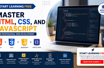
Beginner-Friendly CSS Learning Path
Master CSS for Modern and Responsive Web Design
Learn HTML and CSS, Flexbox, Grid, custom properties, responsive layouts, media queries, animations, typography, and Tailwind CSS through practical website projects.
Start Learning FreePreview availability and included materials may vary. Selected Preview access may not include the complete program, all practical projects, graded assessments, or the certificate. Financial aid may be available for eligible learners. This page may contain a promotional link.

